The following Movie Review On Stranger Things and Its Visual Effects is an important topic for everyone to think about. If you need some great paper writing services to help you craft a similar one, don’t hesitate to address us.
Stranger things were a big hit for those who want some teen adventure and lots of suspense and drama. Stranger things, unlike other shows, does not follow a fixed pattern. It is a show that reminds us of the 1970s and 1980s. Shows like Stand by Me, The Goonies, and several other shows of the late nineties are related to Stranger Things. Several aspects, even scenes from the past seasons, are repeated and reenacted in different ways. The visual effects have been used to create a similar feel. The visual rhetoric of the season is of critical importance. This paper will analyze how visual rhetoric is used throughout the season.
The first thing in which visual effects were used as the monster or creature was the center of focus of the season. The creature has been created in the episodes with the help of visual and digital effects. Some certain practical aspects and enhancements have been made using different digital effects. An analyst Steffen Reichstadt, who works at Aaron Sims Creative, says, “The real success story here was how the two techniques complemented each other.” That is a success that the creature’s creators own (“Stranger Rhetorcial Things”, 2021). Duffer Brothers have paid homage to their favorite era of cinema. They have created an object of supernatural nature and created a vibe of the 1980s with the kinds of lights, scene settings, and props used in the episodes. These eight episodes can make the regular cinema viewers nostalgic by giving a flashback from the past. The dressing of the characters, their habits, homes, lighting, and games that they play are all related to an era when children were into technology. They used to bicycle around their homes and play games like treasure hunts, etc. so, this has been possible by using those visual effects (Weingarten,2016).
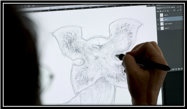
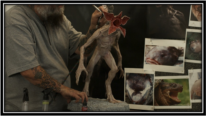
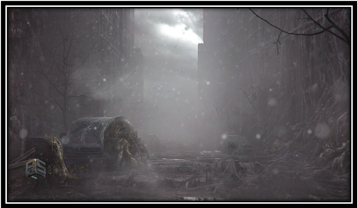
The most notable visual aspect used in the season is the creepy creature that has been an important part of the storyline. The filmmakers created this creature manually and then enhanced it with digital effects in the Stranger Things studio. This process started with a sketch. Inspirations from real-life objects have been taken. There are different aspects involved. A model was then sculpted, and it was then used to make this object. The added digital effects have enhanced the entire concept. The hybrid approach of the directors allows them to show these objects to be much more than they are. Digital technology has enabled ASC to prepare for the ideation process from the start. They had more time on their hands to be more creative and develop better ideas.

The visual homage the season pays is not typical. It is a treat for the viewers. Matt, Ross Duffer, and Shawn Levy patterned scenic designs, visual composition, and character configurations meticulously. They have curated the entire process diligently so that even if it was shot in 2016, the season conveys its vibe authentically. Nobody would say that this season did not make them nostalgic. This played a huge role in making this season a hit not only in the younger generation but those who saw such seasons and movies back in their teenage also find it relatable (“Stranger Rhetorical Things,” 2021). The result of such an effort by the directors in this season is that we can connect to many things from our past. If we try to note the little details, we notice that Lucas’s red bandana refers to Rambo; he is paying tribute to Commando in the entire scene where he prepares for a battle. Even in the plots of each episode, he is referring to the plots of Stephen King’s novels and John Carpenter movies. It is a nostalgic pastiche that makes the 80s kid in all of us nostalgic and emotional (Blakemore, 2014).
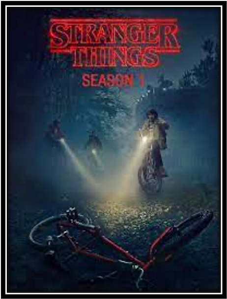
More visual techniques that have been used in this season are the color in the title of the season. As you start watching an episode from the season, you come across a bright label of Stranger Things right in the beginning. The colors used in this title are red, black, and white. They appear in the same sequence. Marketing agencies normally use these colors for advertising food. The use of these colors makes this title even more prominent. The color black conveys power, strength, intelligence, and straightness. The use of this is overwhelming. The color red is very attractive. It convinces people to buy the product immediately. The white color adds contrast to both colors. This wise choice of colors made for the title in the season tells a lot about the season. These colors let the viewer know that there will be suspense, horror, and lots of drama in the season. So, visual effects have been added to the title so that the entire idea of the season can be presented to the audience beforehand and their interest in the season is enhanced. It helps them to market their season well. The look of the season is quite impactful. It is also party due to the colors in the title.
The entire vibe of the show has been very organized. Although the show makers have used different digital effects, they do not mare the reality of the situation. The show is set in Hawkins, Indiana. The organic feel of the area has been kept quite real. In one of the types of research, it is noted, “Icons operate referentially, in this case denoting specific people with identifiable characteristics” (“Stranger Rhetorical Things”, 2021). The feel of the eighties that had to be created has been created using different aspects, from props to the actors’ costumes. In an interview, the director defines the vision of the season as, “We never wanted to be ironic; we didn’t want to wink at the audience. We wanted it to play like one of those movies would’ve back then; that was sort of the goal. So, the hope with the references or whatever is that they don’t pull people out of it. The way we tried to get away with that was being truthful to what the characters would do in their situations and make sure it all makes sense” (M. Duffer, The Daily Beast, August 8, 2016). So, the choice of place has been made very thoughtfully. The directors tried that the reality of the scene is not lost. They focused on keeping things the way they were instead of changing them.
Moreover, they pictured their characters so that they gave an impact that they were in the eighties. Children, their attire, activities, and props like bicycles were chosen to refer to the 80s while the city’s situation as the set was not changed. So, by doing so, the directors could create a very real effect. The season did not seem too much out of time but made its audience nostalgic. So, this is how Stranger Things uses visual rhetoric and makes this season a success.
Works Cited
Stranger Things. (2016). [Video]. Retrieved 13 December 2021, from.
Blakemore, M. (2014). Works. Retrieved from: https://www.imaginaryforces.com/about
Weingarten, Christopher (2016, August 1). ‘Stranger Things’: Meet the Band Behind Show’s Creepy, Nostalgic Score. The Rolling Stones.
Stranger Rhetorical Things. Stranger Rhetorical Things. (2021). Retrieved 13 December 2021, from https://strangestrhetoricalthings.wordpress.com/.